C by GE.png

GE Lighting

2020
Product design • Rightpoint Consulting

Role: Design strategy, Design Project Lead, iOS design lead
Team: Account manager, product managers, tech lead, iOS lead, Android lead, iOS developers, Android developers, designers, QA

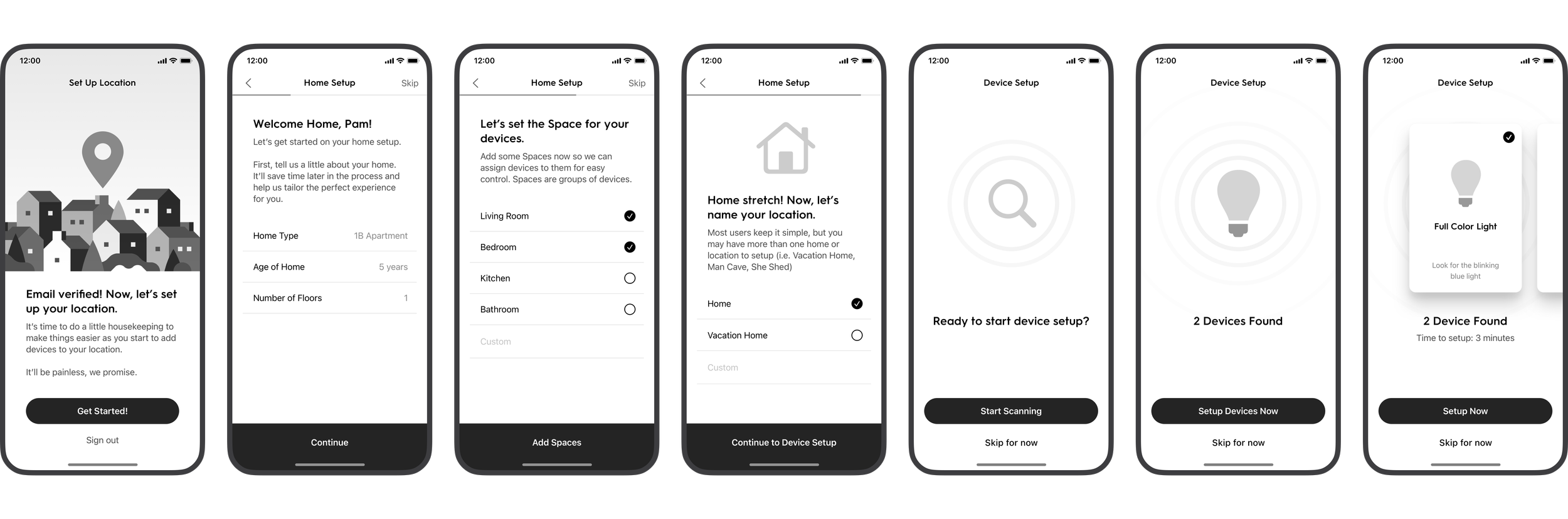
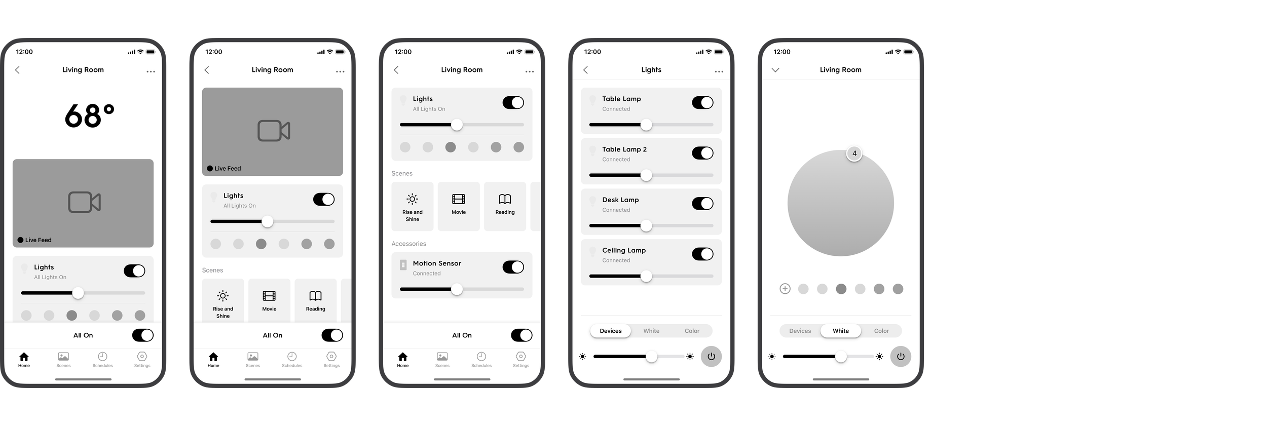
Problem: Current architecture of the live apps was limiting the opportunity to expand the product line for GE Lighting. User experience and overall user sentiment on both iOS and Android app stores was negative and in need of advisement.
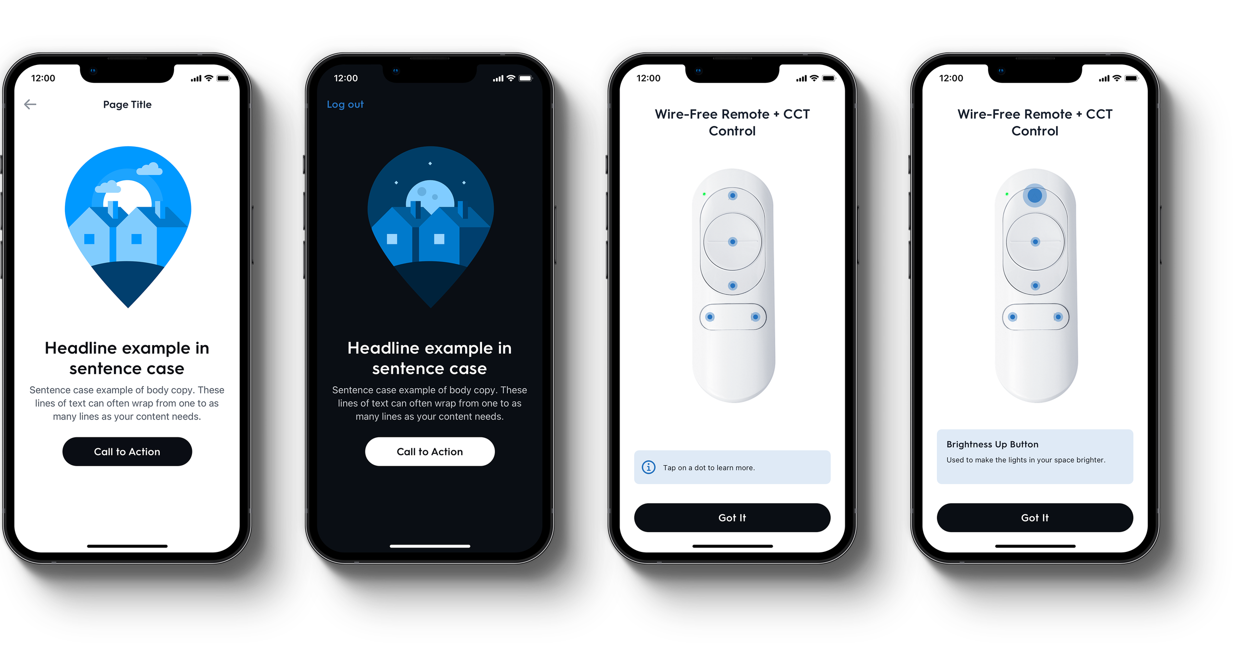
Ask: Redesign and rearchitect C by GE iOS and Android smart-home apps

Tools: We instituted the use of Abstract as our source-of-truth, version control platform for all of the design work we completed as a design team. I worked with 4 designers to implement a working process where we used Sketch and Abstract to manage a rapid design-handoff and collaboration with development. Zeplin was used as the primary communication layer when delivering final designs to development.

Additionally, we used Overflow as our presentation tool for the purpose of explaining detailed user flows to both client partners as well as development.

Once we were aligned on the problem and the goal for the project, we got to work on the initial ask: a re-designed, re-architected iOS and Android app.

Concept Phase

During the course of the project, we designed and presented wireframes for MVP and future-state opportunities after participating in hands on activities during multiple on-site client meetings. We led a lean Google Sprint after our initial project team evaluated the current app experience.

Following the Google Sprint and client meetings, we got to work on a gameplan presentation. A gameplan is a company deliverable we provide to the client based on what we learned during client kickoffs and Google Sprint findings. This is essentially a formal presentation of our collective goal for the project. The deck we presented included an initial stab at easy win UX refinements, as well as more in-depth design opportunities that we designed after our kickoff and subsequent competitor research of the current market.


Onboarding & Sign in

Onboarding

From collaborating during the Google Sprint and evaluating customer pain points, one of the opportunities to improve included an introductory set of onboarding screens to highlight app features for new users.


Home & Device Setup

After studying the smart home industry and understanding what problems customers face, we suggested a simpler way to set up homes. Instead of having separate steps for each task, we combined them into a few initial steps to make the setup process easier. We worked with customers to come up with words that reflect how they organize their homes. This way, new users will naturally learn these terms when they set up their home for the first time.


Connectivity and Device Management

Connectivity

We prioritized device connectivity when redesigning the C by GE app. The old experience took users directly to the Home Screen with no feedback on their device status. Because of technical issues, users frequently experienced false connection failures.

To make sure users have the best experience, we designed different loading states. When users open the app, they will see standard skeletal loaders. For a fresh relaunch of the app, we suggested using a full-screen loading screen. This screen would show brief content about app features or promotional messages for new products.

Device Management and Grouping

As we defined the logic around device management and orgnization, we looked for ways to build in flexibility within all screens where devices were displayed. Under device settings, we wanted to give users ease in being able to edit single devices, the ability to quickly reassign to a different room, and ease in grouping devices to be controlled together.


Schedules

Another area of the app that was challenging to use and not optimized for user needs was the Schedule/Automations feature. For first time users, we would present users with an empty state screen explaining the feature and a pre-defined set of common schedules to give users an idea of what they can configure. The final improvement would be an optional Guided Setup that would take the user through a wizard flow of separate screens asking the user to make selections based on the configurability of each schedule type.


Room Management


Future State


Visual Design


Onboarding

According to experts, if your app needs onboarding screens, it means it's too complicated. However, the old app didn't give any upfront help or explanation on how to start using it. So, we decided to provide this information to new users to make sure they have the right context around features before setting up their home. To reach more people, we made the "Create Account" and "Log In" actions always available, making the onboarding screens optional.


Approachable and more interactive

We introduced an illustration style that softened the experience and connected users to the content presented in the app. It made the app less technical and more approachable. Additionally, when setup was completed, we introduced a mini demo of products to educate users on how to use the physical products with the app.


Improved Device Setup

We brought our proposed illustration style into device setup to connect the users to their products and to adequately explain how the physical products will interact with their app experience. Our hypothesis was that reducing lengthly text instructions and incorporating more visuals would reduce time to setup.


A seamless, consistent Home Screen

One of the goals during the visual design phase was to bring consistency to the overall experience. The redesigned Home Screen would be reflective of a user’s home setup. The same organization and patterns were carried into the room screens as well, providing an experience that was easy to use and familiar across multiple touch points within the app ecosystem.

The top section across home and rooms would be indicative of the global controls applicable at each level. They would overflow into a horizontally scrolling carousel depending on how complex a home setup became. This flexibility ensured that all use cases could be handled with the same design.


Easy to use Color Settings

Taking cues from photo editing apps like the iOS photo app and VSCO, we implemented a color setting screen that allowed users to adjust their favorites in context of the color wheel they opened to view their current light color settings.

Impact and Outcomes


Learnings

Divide and conquer on features, not platforms

We had one team member per platform, and iOS led the project. As the project lead, I established the roles for each designer. We had one designer for iOS, one for Android, and one gatekeeper that worked across both platforms creating components. In order for us to keep all developers fed, we made sure one designer was devoted to a platform and our system gatekeeper could keep forging ahead on documenting components.

This at the time felt like the best path forward. If we could go back and change it, it may have made more sense to divide and conquer across platform. Allowing one designer to build out a feature set across both platforms.

Establish rules of engagement early on

As a design team, we need to make sure we understand how to work together. From the project team level, we established rules of engagement in the form of team agreements. As a design team, we organically established a system for collaboration, but setting time before the team was to get started forging ahead, we should have aligned as a group on how to get the work done (i.e. how to communicate changes, how to push updates/commits, how to ensure we’re not duplicating work).

Stay true to platform norms

In the beginning of the project, we were hung up on the fact that the existing iOS and Android apps felt vastly different. The visual language and patterns did not feel unified across platforms.

Our overarching goal to unify the language was sound in theory, but in practice, we should have embraced the platforms early on as we tried to gain efficiencies with base elements (fonts, icons, spacing, navigation).

Since we had the flexibility of two teams and two code bases, it was a chance for us to harness that opportunity.